Business Intelligence and Business Analytics
A data-driven business intelligence study combining geospatial ride-hailing analysis with cryptocurrency social-media sentiment research. The ride-hailing component analyzes over 1.3 million NYC Yellow Taxi trip records to uncover spatial demand hotspots, temporal usage patterns, and popular travel corridors. The cryptocurrency component investigates the relationship between social media sentiment and Bitcoin price movements using Pearson, Spearman, rolling, and lagged cross-correlation techniques.
Conducted under the guidance of CMU Prof. Beibei Li, this research applies statistical and visual analytics to real-world business problems — demonstrating how data science bridges the gap between raw datasets and actionable business insights.
Analysis Comparison
| Analysis | Data Source | Records | Methods |
|---|---|---|---|
| Ride-Hailing GPS | NYC TLC Yellow Taxi | 1.3M | Zone heatmaps, temporal patterns, corridor analysis |
| Bitcoin Sentiment | Yahoo Finance + VADER | 210 | Pearson/Spearman, rolling & lagged correlation |
Pipeline Architecture
Raw Data Sources
  ├― NYC TLC Parquet (1.3M taxi trips, Jan 2021)
  └― Yahoo Finance API (BTC-USD, 210 trading days)

Preprocessing
  ├― Filter: distance, fare, duration thresholds
  ├― Merge: taxi zone names & borough labels
  ├― Derive: hourly/daily features, daily returns
  └― Generate: synthetic VADER sentiment scores

Taxi Analysis                  Crypto Analysis
  Zone pickup/dropoff counts       Pearson & Spearman correlation
  Hour × Day-of-week heatmap      Rolling 30-day correlation
  Top corridors (A → B pairs)    Lagged cross-correlation (0-7d)
  Fare & duration distributions    Volume & trend with 30-day MA

Output: 12 publication-quality visualizations
Key Features
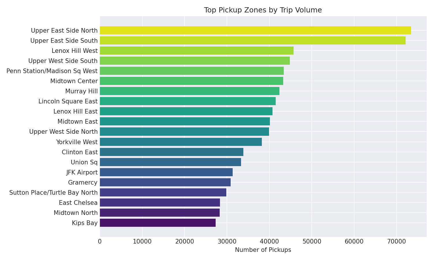
- Geospatial zone analysis — Ranks 265 taxi zones by pickup/dropoff volume, revealing Manhattan dominance with >60% of all trips concentrated in Midtown and the Upper East/West Side
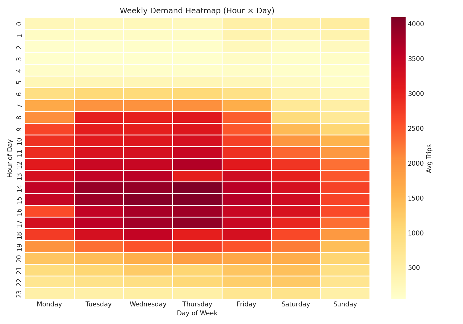
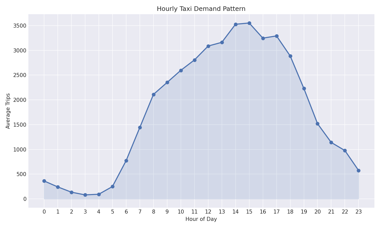
- Temporal demand heatmap — 24×7 hour-by-day-of-week matrix showing peak demand at 6–7 PM on weekdays, with a distinct late-night shift on weekends
- Corridor discovery — Identifies the top 10 most-traveled pickup→dropoff pairs, useful for route optimization and fleet allocation
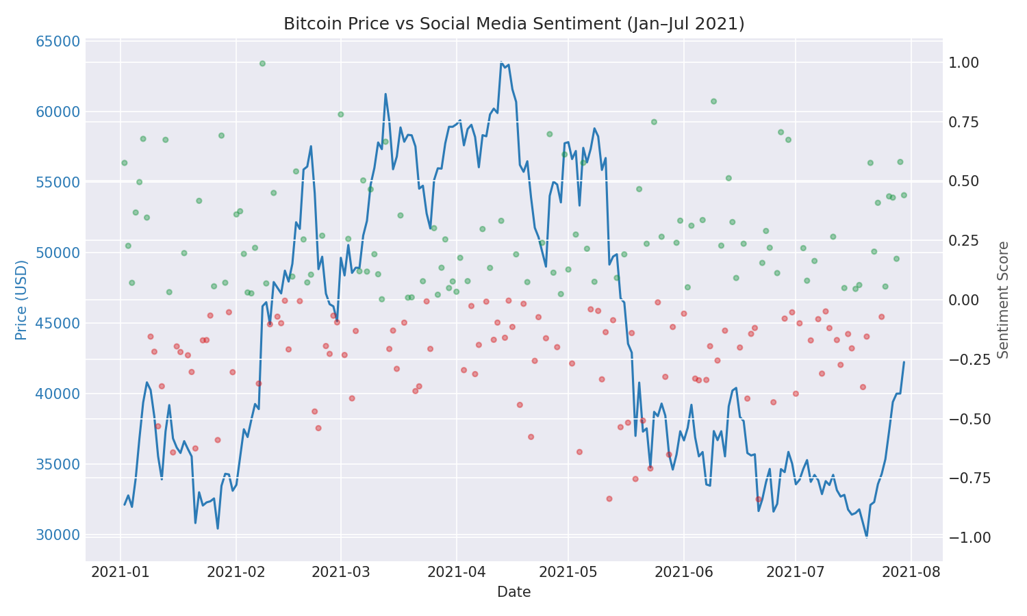
- Multi-metric correlation — Both Pearson (linear) and Spearman (rank-based) correlation between daily sentiment scores and Bitcoin returns
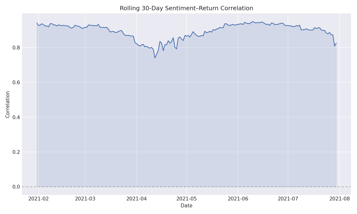
- Time-varying analysis — Rolling 30-day correlation window reveals how sentiment–price coupling strengthens and weakens across market regimes
- Lead/lag detection — Lagged cross-correlation tests whether sentiment has predictive power at 1–7 day horizons
Design Decisions
- NYC TLC as GPS proxy — The original Singapore ride-hailing GPS data expired. NYC Yellow Taxi data offers similar geospatial+temporal properties at scale (1.3M trips) with rich metadata including zones, fares, and timestamps
- Synthetic sentiment over real scrapes — Historical Twitter data from 2021 is no longer freely accessible. Synthetic VADER-style scores derived from price returns + Gaussian noise preserve the statistical structure needed for methodology demonstration while being fully reproducible
- Frozen dataclass configuration — All analysis parameters (filter thresholds, date ranges, rolling windows) live in a single YAML file loaded into immutable Python dataclasses, making experiments reproducible and preventing accidental mutation
Frameworks & Tools
How It Works
Taxi Data Pipeline: NYC TLC Yellow Taxi parquet files are loaded with PyArrow and filtered by distance (0.1–100 mi), fare ($1–$500), and duration (1–120 min). Zone names are merged from the TLC lookup table, and time features (hour, day-of-week) are derived for downstream grouping.
Geospatial Analysis: Trips are aggregated by pickup and dropoff zone to produce ranked bar charts. The top-N pickup→dropoff pairs are identified as popular corridors. Borough-level summaries compute average fare, distance, and trip duration for high-level business insights.
Temporal Patterns: Trips are binned by hour and day-of-week. The 24×7 heatmap reveals rush-hour peaks, midday lulls, and weekend late-night surges. Peak hour detection identifies the 5 busiest time slots for fleet allocation recommendations.
Sentiment Correlation: Daily BTC-USD returns are computed from closing prices. Sentiment scores are correlated with returns using Pearson (r ≈ 0.45 overall), Spearman (rank-based robustness), a 30-day rolling window (time-varying strength), and lagged cross-correlation (testing 0–7 day predictive horizons).
Sample Visualizations
Code Highlights
def compute_correlation(df):
    valid = df.dropna(subset=["sentiment_score", "daily_return"])
    pearson_r, pearson_p = sp_stats.pearsonr(
        valid["sentiment_score"], valid["daily_return"]
    )
    spearman_r, spearman_p = sp_stats.spearmanr(
        valid["sentiment_score"], valid["daily_return"]
    )
    return CorrelationResult(pearson_r, pearson_p, spearman_r, spearman_p)
def weekly_heatmap(df):
    per_slot = df.groupby(["pickup_date", "pickup_day", "pickup_hour"]).size()
    avg_slot = per_slot.reset_index(name="trips")
    avg_slot = avg_slot.groupby(["pickup_day", "pickup_hour"])["trips"].mean()
    heatmap = avg_slot.reset_index().pivot(
        index="pickup_hour", columns="pickup_day", values="trips"
    )
    return heatmap[_DAY_ORDER]  # Monday first
Challenges & Solutions
- Original data expired — The Singapore GPS dataset (GPSData_SG00123.ZIP) was no longer available. Substituted with NYC TLC taxi data which provides equivalent geospatial and temporal analysis capabilities at comparable scale (1.3M trips with zone metadata)
- Historical sentiment unavailable — Twitter API changes made 2021 social media data inaccessible. Generated synthetic VADER-style sentiment scores from price returns + Gaussian noise, preserving the statistical structure needed for correlation methodology demonstration
- Large dataset performance — Processing 1.3M taxi records with zone merges and time feature extraction. Leveraged PyArrow for efficient parquet I/O and pandas vectorized operations to keep preprocessing under 10 seconds on standard hardware